Best Airbnb Paint Colors: Color Psychology for Rentals
For your Airbnb or short-term rental (STR) property, paint color isn't just a decorative choice. It's one of the highest-ROI business decisions you'll make. The right color palette can transform your listing photos, elevate guest perception, and drive revenue growth—especially when integrated thoughtfully into contemporary design schemes. The wrong colors can leave potential guests scrolling past your property.
At STR Cribs, we understand that effective STR design goes beyond current trends. We leverage color psychology in hospitality to create spaces that feel welcoming and memorable and photograph well, a critical factor in today's competitive marketplace.
Our mission is to help hosts make choices that boost their bottom line as specialists in data-driven design and renovation for short-term rentals. This guide to the best paint colors for Airbnb properties provides the insider knowledge needed to make effective paint selections that align with current design trends.
Why Airbnb Paint Color Matters
For traditional real estate, curb appeal attracts buyers from the street. For your Airbnb, that first impression happens online. Your listing photos are everything: they convince a potential guest to click, book, or keep scrolling. The right paint colors make spaces appear brighter, larger, cleaner, and more inviting in photographs—a key element of any comprehensive design style guide. Our analysis shows that properties with strategically chosen paint colors achieve higher click-through and booking rates than those with haphazard color schemes.
The Psychology of Space
Color affects mood subconsciously. Your guests seek a relaxing escape from their everyday lives, whether for business or pleasure. Jarring colors create tension, dark colors make spaces feel cramped, and certain undertones can make a clean room feel dingy. These responses influence not just the enjoyment of the stay but the booking decision. Implementing thoughtful STR design tips like strategic color selection creates an emotional connection with potential guests before they visit, especially when paired with contemporary design schemes that enhance the overall aesthetic, and understanding how to furnish your Airbnb for maximum profit ensures your color choices work harmoniously with your furniture selections.
Top Neutral Paint Colors for Rental Properties
In the STR industry, neutral paint colors for rental properties are the gold standard. Neutrals have mass appeal, create a versatile backdrop for your furnishings, make spaces feel larger, and remain timeless. The right neutrals are strategic and align with current design trends; they allow your property's character to shine through while providing the clean, fresh canvas that guests expect.
The Allure of Whites
White walls create a sense of brightness, cleanliness, and spaciousness appealing in listing photos. However, not all whites are equal; undertones matter. The wrong white can feel sterile and cold or jarringly yellow, which is especially important when planning creative Airbnb themed room designs.
- Benjamin Moore "White Dove" (OC-17): A soft, warm white that's versatile and avoids a sterile look. It's perfect for creating a cozy atmosphere while still appearing "white" in photographs.
- Sherwin-Williams "Alabaster" (SW 7008): A slightly warmer, off-white that was Sherwin-Williams' 2016 Color of the Year. It's soft and calming, providing a perfect backdrop for any décor style from modern to rustic.
- Behr "Swiss Coffee" (12): A classic creamy white that adds warmth without looking yellow. It is excellent for living rooms and bedrooms, especially in properties with limited natural light.
The Sophistication of Grays
Gray offers more depth than white while remaining neutral. It can feel modern, sophisticated, and calming. Choosing the right gray is crucial, as undertones can shift dramatically in different lighting.
- Sherwin-Williams "Agreeable Gray" (SW 7029): The most popular "greige" (gray + beige) in the industry. It's a chameleon color that works in nearly any lighting and complements all décor styles and accent colors.
- Benjamin Moore "Revere Pewter" (HC-172): A light gray with warm undertones that prevent it from feeling cold. It's a timeless classic that adds elegance and works well in open-concept spaces where color flow is essential.
- Behr "Silver Drop" (790C-2): A lighter, cooler gray that makes a space feel open and modern without being cold. It has a subtle depth that photographs beautifully and provides enough contrast against white trim.
The Warmth of Greige and Taupe
These hybrid neutrals are perfect for hosts who find gray too cool and beige too dated. They offer warmth, sophistication, and flexibility, making them ideal for STRs in any market.
- Sherwin-Williams "Accessible Beige" (SW 7036): A beautiful beige with gray undertones that feels current and not "builder-grade." It pairs well with warm and cool décor elements, making it adaptable to seasonal styling changes.
- Benjamin Moore "Edgecomb Gray" (HC-173): A soft, organic greige from their Historical Collection. It's earthy and versatile, creating a subtle backdrop that is fresh and timeless.
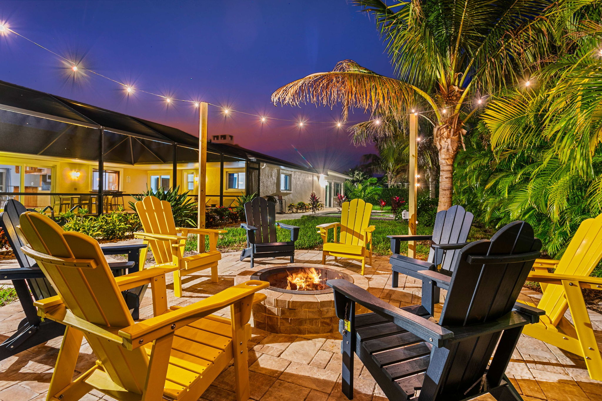
Using Bold Colors Strategically for a "Wow" Factor
Neutrals form the foundation of a successful STR color strategy, while strategic pops of color create memorable moments that help your property stand out. The key word is strategic: painting an entire property in bold colors is a mistake, but thoughtful application creates a unique brand identity for your rental.
The High-Impact Accent Wall
An accent wall creates a focal point that draws the eye and serves as the perfect backdrop for your listing's hero shot. This approach adds personality without overwhelming the space or limiting your decorating options.
- Deep blues like Benjamin Moore "Hale Navy" (HC-154) create a sophisticated, calming focal point behind a bed or in a dining area.
- Moody greens like Sherwin-Williams "Pewter Green" (SW 6208) provide an organic, grounding presence that photographs beautifully and connects indoor spaces with nature.
- For dramatic impact, consider a sophisticated black like Behr "Limousine Leather" (MQ5-5) for a high-end, editorial look that elevates a simple space.
Small Space, Big Personality
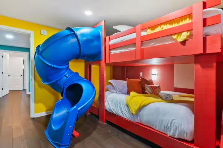
Small, enclosed spaces like powder rooms, entryways, or reading nooks allow for bolder color choices. The "jewel-box effect" creates an intimate, memorable moment in your property by using deeper, saturated colors in small spaces.
In these spaces, you can experiment with colors that overwhelm larger areas. Rich teals, warm terracottas, or dramatic charcoals can transform a forgettable space into a standout feature that guests mention in reviews and share on social media.
Aligning Color with Your Property's Theme
The most successful STRs have a cohesive identity tied to their location or unique selling proposition. Your color choices should reinforce this identity:
- Soft blues and seafoams create an immediate connection to the water for a coastal cottage.
- Mountain cabins benefit from earthy greens, rich browns, and rustic reds that echo the landscape.
- Desert properties can use terracotta, dusty rose, or sage to complement the natural environment.
This alignment between your property's theme and color palette demonstrates a deeper level of design thinking that guests appreciate and respond to.
Essential Technical Choices for Airbnb Paint Colors
The color is only half the battle for Airbnb interior paint. The technical specifications are crucial for durability, appearance, and long-term value.
Choosing the Right Paint Sheen
Understanding the best paint finish for rental properties impacts aesthetics and maintenance:
- Matte/Flat:
- Pros: Hides imperfections well.
- Cons: Difficult to clean, scuffs easily.
- Best for: Ceilings only in a rental.
- Eggshell:
- Pros: Low sheen, more durable and washable than flat.
- Cons: Can scuff in high-traffic areas.
- Best for: Low-traffic areas like bedrooms and formal living rooms.
- Satin: (Recommended)
- Pros: Velvety sheen, very durable, and easy to clean.
- Cons: Can show brush strokes if not applied well.
- Best for high-traffic areas, including walls, hallways, and kitchens/bathrooms in rental properties.
- Semi-Gloss:
- Pros: Durable and moisture-resistant.
- Cons: High shine shows imperfections.
- Best for: Trim, doors, and cabinetry where a clean, defined look is desired.
Understanding LRV (Light Reflectance Value)
LRV (Light Reflectance Value) is a scale from 0 (black) to 100 (white) measuring light reflection of a color. This specification is helpful when selecting paint for specific rooms in your STR.
In spaces with limited natural light like basements, north-facing rooms, or small-window areas, choose colors with a higher LRV (60+) to maximize light. In bright, sun-drenched rooms, a color with a slightly lower LRV can prevent glare and create a comfortable environment.
Many paint manufacturers list the LRV on their color chips or websites. This allows you to make informed, technical color selection decisions.
Creating a Cohesive Whole-House Palette
Professional designers rarely select colors room by room. Instead, they develop a cohesive palette that flows throughout the property. For your STR, select 3-5 complementary colors that create a professional, harmonious feel.
A common strategy includes:
- One main neutral for most walls
- One white for trim, ceilings, and doors.
- One or two accent colors for specific rooms or features
This approach ensures your property feels thoughtfully designed rather than haphazardly assembled.
Conclusion
Choosing the right colors for your Airbnb involves many considerations. You need to select the perfect neutral base, decide on strategic accents, choose appropriate finishes, and ensure everything photographs beautifully. Managing these factors while running a successful rental business is challenging. This is where professional expertise transforms an expense into a high-return investment.
At STR Cribs, we maximize short-term rental profitability through strategic design. We analyze market data to select color palettes that attract guests in your market. Our approach is fundamentally different because it focuses on business outcomes, not aesthetics.
FAQ
What is the best, safest paint color for an Airbnb?
Depending on lighting, top performers across various properties and markets are an off-white like Sherwin-Williams Alabaster or a warm greige like Benjamin Moore Revere Pewter.
Should I paint my Airbnb ceiling white?
Yes, almost always. A flat white ceiling (like standard ceiling white) makes the room feel taller and brighter, creating a more spacious impression in photos and in person.
What paint color best hides dirt and scuffs?
The best options are mid-tone neutrals like greige or taupe in satin finish. They don't show dust like dark colors or scuffs like stark white, making them ideal for high-traffic rental properties.
Is it a bad idea to let guests see different paint colors in every room?
Maintain a cohesive color story. Using varying shades of the same core palette is better than using clashing colors in every room, which can make the property feel disjointed.

.jpeg)
.jpeg)